In this report I want to look at Airbnb data which are publicly available for further use. The dashboard for the current report has been setup with Metabase and is publicly available for use.
Let’s start by looking into the initial data:
Cities
As you can observe through the home tab of the charts, These are the data you can check for each city. I will give my opinion about a few of them.
Let’s look at the neighborhood disparity of prices in Amsterdam:
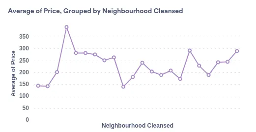
We can see that there are a variaty of prices between 150 & 400 Euros while the prices are fairly in an even distribution among the neighborhood.
Now let’s look twoards another city: Antwerp
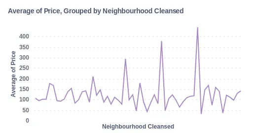
It is clear that the range of price difference is more than the amount we have in Amsterdam. Also we can observe that there is a larger group discrepancy as there are more critical points in Antwerp compared to Amsterdam.
Now let’s observe another metric: Score rating. First let’s take a look at Amsterdam:
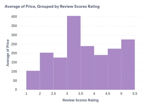
To my surprise, From the looks of it the corelation between price and score rating in Amsterdam looks more like a normal distribution, Meaning high prices would mostly indicate a middle of the pac rating by the users.
Let’s look at the same stats for Antwerp:
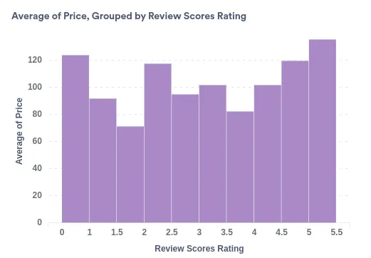
Antwerp is closer to what I expected, As we can see the averages of prices are to some extent near the averages of scores.
I should note that this is not the version I put in the dashboard. This version does not contain the name of neighbourhood and the number of reviews for each respected chart.
If we look at the number of reviews for each rating, We can see that the number of ratings between 0 to 3 are far less than the 4 & 5 ratings, So these ratings should not be relied upon in comparison.
comparison
Now let’s compare these 3 cities to each other. First, Let’s compare the reviews of these cities:
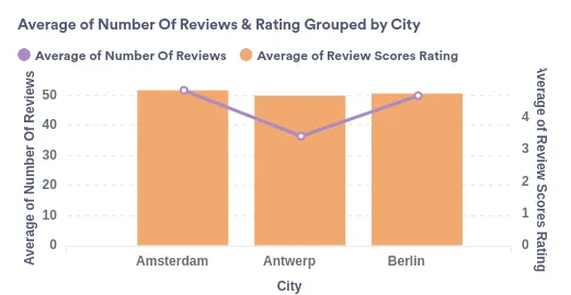
While we can observe that These set of data are pretty similar, We can clearly see that even though Antwerp is a big city, Compared to Berlin & Amsterdam which are the capital, It still has less reviews.
Now let’s take a look at the average amount of nights spent in these cities:
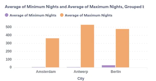
Interestingly we can see people stay in Antwerp for a longer amount of time than Both Berlin & Amsterdam. It maybe duo to the fact that people who move to a city that is not the capital usually have a reason to stay for a longer amount of time.
That said we can see that the average stay in Berlin is longer than the other two. Perhaps because more people come to stay for events, It would be required to reserve the rooms for more days than a week. Maybe the UEFA fan festival which takes more than a month would increase this average. This has to be observed more delicately though It is not available within this sets of data.
Now let’s walk through another topic: Super hosts.
Superhost
Superhost is an accolade in airbnb given to those who have high score in reviews. I want to look closely to available data from these superhosts.
First, let’s take a look at superhosts average reviews:
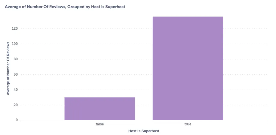
This chart is for the city of Amsterdam. While all cities follow the same trend in this category, The biggest difference in this category is in Amsterdam. The number of reviews for superhosts are near 5 time larger than people who aren’t. This must mean they are using a way to get the guests to write a review. Maybe a research should be conducted to find out how they gather more reviews.
Now let’s look at the average of minimum & maximum nights in comparison between superhosts & regular hosts:
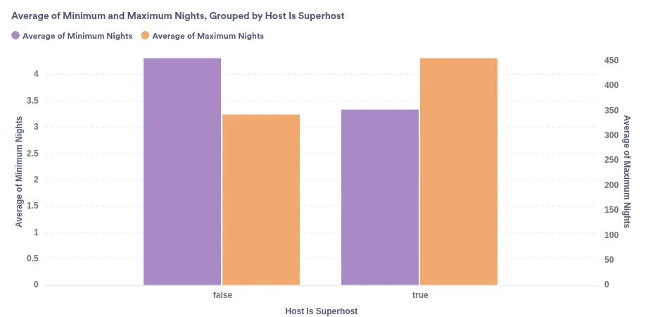
Again this is the chart for the city of Amsterdam as I did not want to clutter the charts and put all of them in one comparison. For this category It looks like all cities follow the same pattern: Higher maximum nights & lower minimum nights for superhosts in compare to the regular ones. The only exception to this rule iis Berlin in which Both category have a higher amount for non-superhosts.
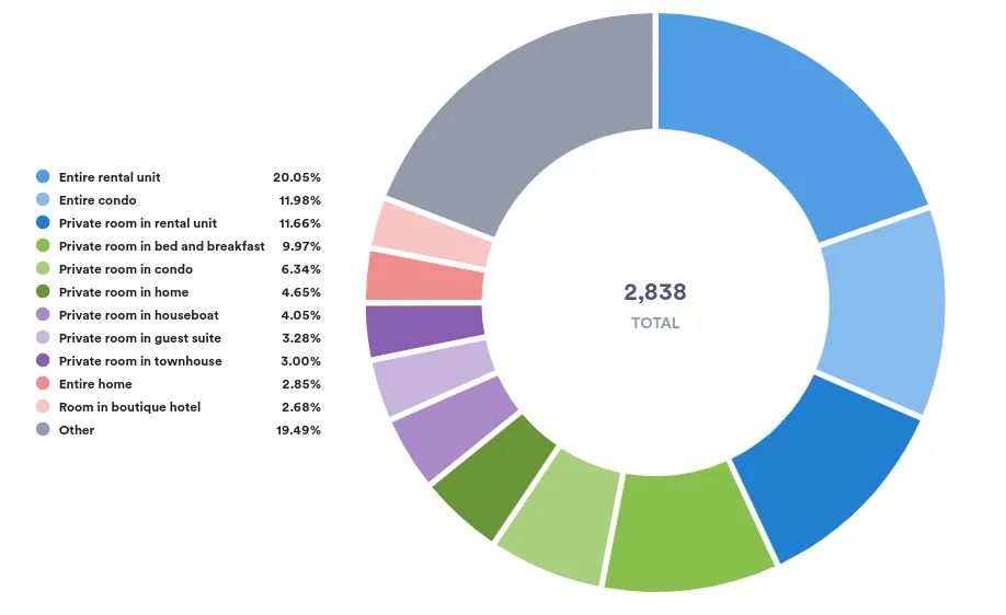
Let’s check one more thing. Let’s see what property types do regular hosts have:

We clearly see that at least more than 76% of the units are for entire house. We can see that 8% of these are private housing but through further cleansing we might reach to a different result. However that is not what we are after.
Let’s take a look at the same stats for the superhosts:
We can see the difference with one glance. at least 41% of the superhosts have private housing units(rooms, beds,..) & even if all of the previous other percents were private housing still it would be 13% less than the superhosts private housing.
I think we can safely assume that either:
- The private housing gain better/more reviews which would lead to them becoming superhosts
- Hosts who have private/single rooms applied more for
Conclusion
We are so privileged to live in times where there are so many datasets available for public use. Even though I wish I could tinker more with this report & gather All the data available and give more inputs(specially for different timely manners).
I only could wish for more data(as any data analyst would) to see when these units where under usage. Having that data would clarify to some more extent why some of the data where as shown above.
All in all, I hope I at least have managed to shed some light in dark corners of your thoughts regarding this matter & honored to share my reports with you as I always have.